The outcome
A clear visual identity applied across packaging and social media: a consistent brand that looks professional on shelf and online — and is easy for the team to use every day.
Context
Where it started.
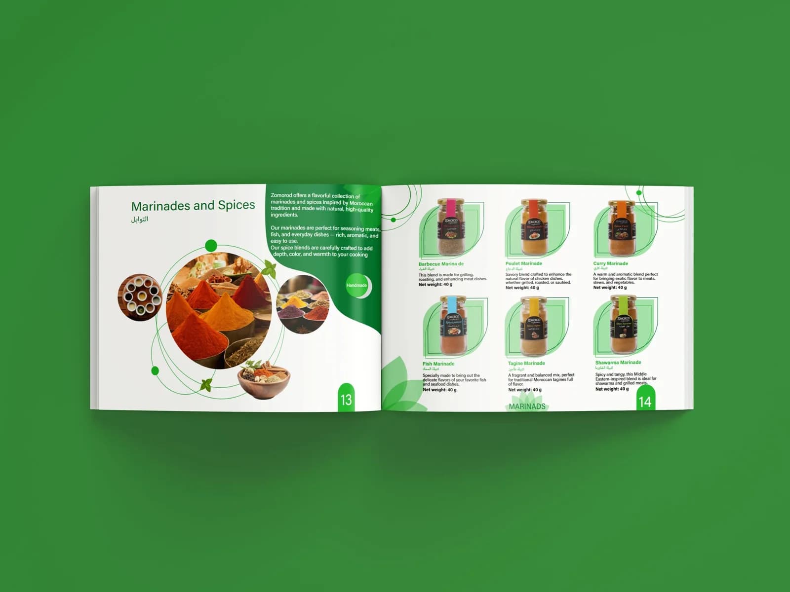
Cooperative Zomorod lives on the shelf as much as on social media — but without a unified visual identity, every asset started from scratch. It needed a clear foundation: colours, typography, layout rules and imagery style, carried across the brochure, packaging and posts.
Key stages
What we actually did
How the project really unfolded, stage by stage — decisions, scope and execution.
Get a free quoteVisual foundation
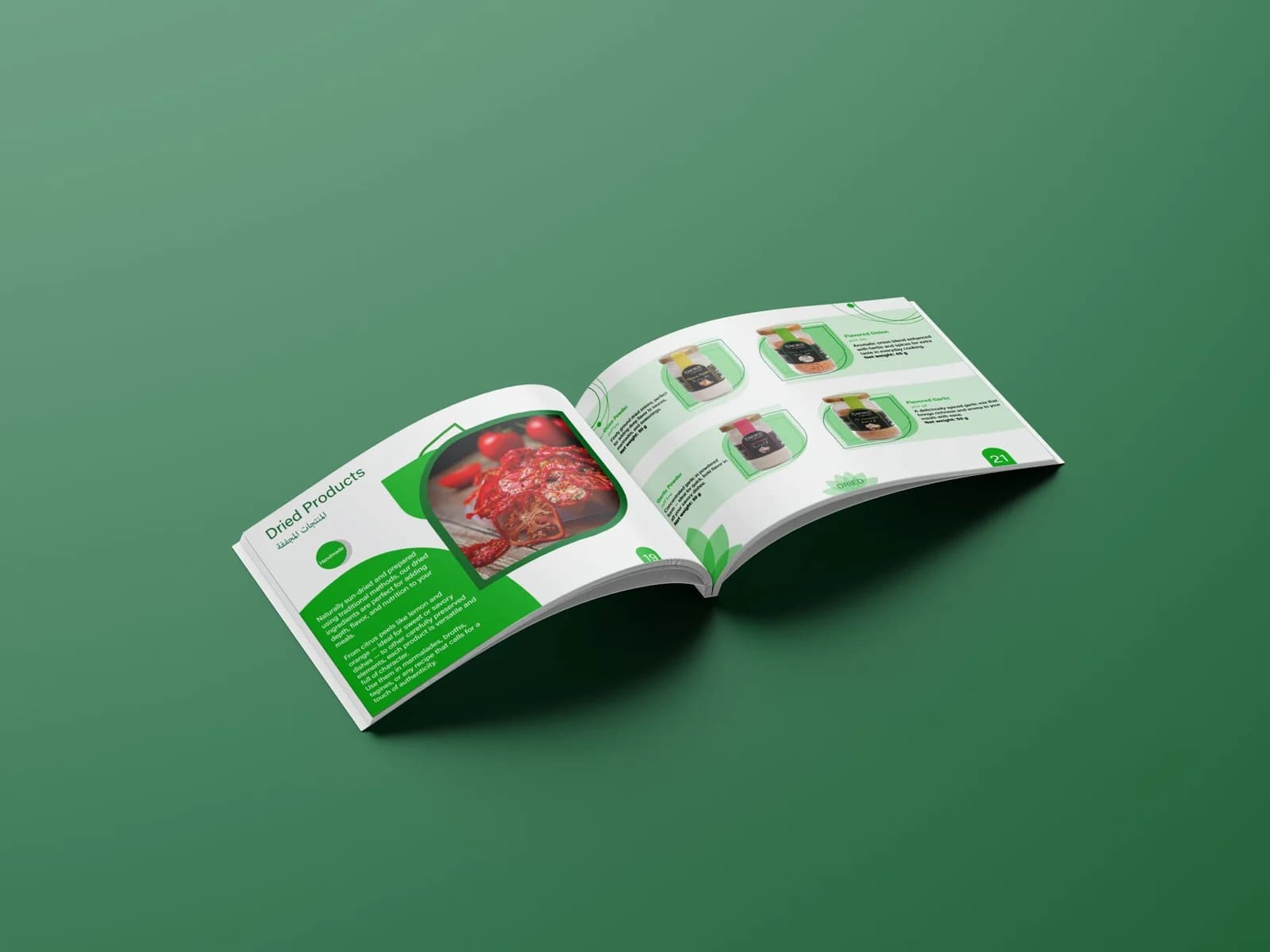
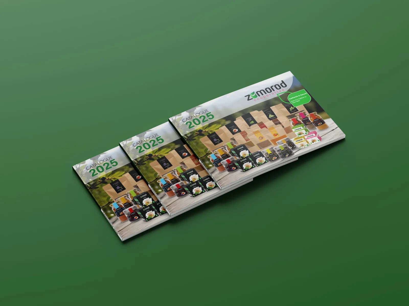
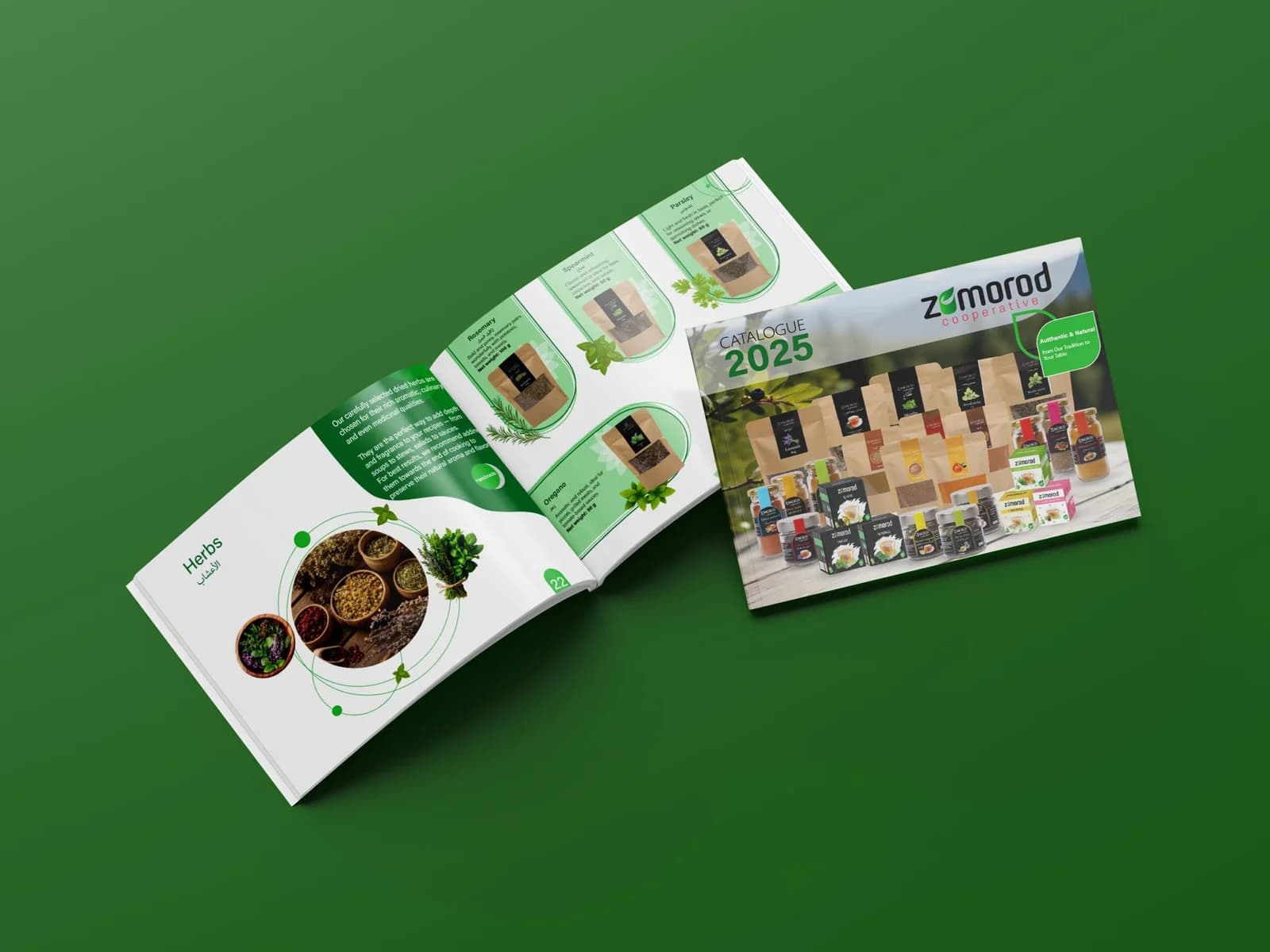
Colour palette, typography, layout rules and imagery style: a simple visual foundation that makes every asset recognisable at first glance.
Brochure & packaging
A brochure presenting the cooperative and its products, alongside packaging mockups for the hero SKUs — designed to hold their own on the shelf.
Social media templates
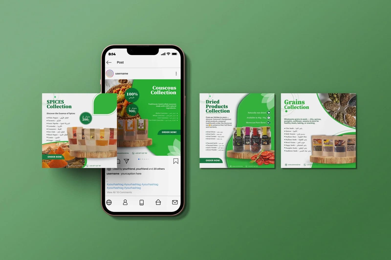
Ready-to-use post and story templates — product shot, pricing, offer and caption space — that the team adapts without depending on a designer.
Impact
What it changed.
A consistent, professional brand, on shelf and online.
Templates the team uses easily, every day.
Print and social assets that speak with one voice.